While there is so much hunger for data, there are only few who understand the stats. Google Analytics is an excellent tool that helps you manage your data and see the progress of your business/campaigns. Data studio make it easy to understand the data.
Connecting Google Analytics to Data Studio
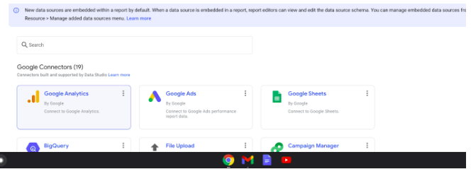
To connect your google analytics data with the data studio, go to datastudio.google.com and log in. Click on ‘Blank Report’ to get started.
After clicking on the blank report, select Google Analytics connector. Select the property you want.
Why is it important?
Before knowing how, one should know why. So, why is it important to visualise your data? Needless to say it is about the way you present. If the data is presented in a well organized/sorted way and is easy to understand you will take more interest in it.
And if you take more interest in it, you will take wise data driven decisions that help your business to grow. You can create a report with minimum effort and refresh the data whenever you want and see the latest numbers.
Features to leverage
Data studio has some of the salient features that help to visualize data. It is important to understand dimensions and metrics first in order to understand the data and create a report on it.
A Metrice is something which we can quantify, like no. of users and a dimension is a condition which we apply while counting metrics.
For example if metrics is no. of users and dimension is age, the report will show us no. of users from different age groups.
Filters in Data Studio
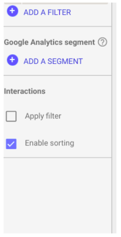
After understanding dimensions and metrics there is a question, where to use it? These will be you while sorting your data in report. After selecting the element click on add filter.
Suppose you own a bakery show shop and your business is online too. You created a special offer for christmas and you want to see how many people ordered using that offer then you will select campaign in the field and christmas in the field and christmas as its name. Click on the save button to save it.
 And you can see the number of customers Christmas offers.
What an insightful data report is?
The whole purpose of visualizing data is to make it more interesting and ultimately to facilitate wise data driven decisions. And here comes the question: how can one make the report more insightful?
Well it’s just the matter of choosing the right metrics and dimensions. If you own an e-commerce website, you may want to see the number of users with different browsers and devices. If you find there are exceptionally less numbers of users from a particular device, you may infer that there may be some compatibility issues of the website. You might check with your development team for it. Likewise it is always important to decide which kind of data is more important to be presented in a report and will be helpful in taking data driven decisions/steps. Happy Analysis!


