Introduction
There are about 2 million apps on the iOS app store and around 2.4 million apps on the android play store.For our app to stand out and to be downloaded we need to take care of the design.
How much a user likes an app is not only related to how many features have you added or how good the code is. These are also important points while implementing the application but the most important point to make the user fall in love with the app is the app design. Following the mail aspects for which the app is designed
- How easy this is
- How beautiful UI is
Designer Vs Non-designer Thinking
We all know that there are four colors in the Indian flag, but from the designer’s point of view, each color has its own meaning and reason. Likewise it varies according to the purpose of the application.
We already know Red is a color of love so, while using a marriage application you always observe the color- red mostly. Following are the colors used to achieve the specific goal:
- Red : Love, Energy, and Intensity.
- Yellow: Joy, Intellect, and attention.
- Green: Freshness, Safety, and Growth.
- Blue: Trust, Stability, and Serenity.
- Purple: Royalty, Wealth, and Femininity.
How to Combine Colors and Formulate Color Palettes?
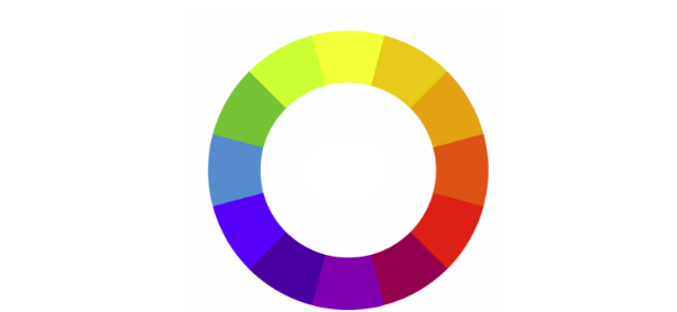
We normally see that there are multiple colors in the one application. There is a way to combine different colors for your app design. Color wheel is a perfect tool for color selection and mostly you must have seen this in your art classes. This is perfect not only for the artist but also for the designers.

There are different color type selections and have their different purposes.
-
Analogous Colors
Analogous colors are basically made by combining the two analogous colors. Suppose, I have an orange color in my design. How would I combine it with the different colors to complete my design? I can select the analogous color like red.

Advantages:
- Easy to locate
- Harmonious
Where to use:
- Background screens
- Main interface of application
-
Complementary Colours
This is opposite to the analogous color. Suppose, We are taking red from the color wheel then we have to select the opposite color from the color wheel.

Advantages:
- Best for the clashy design
- Easy to locale
Where to use:
- App logo designs.
- Attention grabbing designs
-
Split Colors
To decrease the clashes of complementary color instead of taking direct opposite color we can take an analogous two different colors. Now we have three colors in our app design.

Advantages:
- Attention grabbing
- Easy to locale and less clashy
Where to use:
- App logo designs.
- Attention grabbing designs
-
Triadic Colours
If you are working on the traditional application then you must think about the triadic colors. To select the triadic color you have to select any random color and draw the equilateral triangle on the opposite side of the color wheel.

Advantages:
- Attention grabbing
- Well balanced
Where to use:
- Traditional print design and advertising design
Tools For Designing Different Colors
As an app developer we might not have to sit there and combine different color codes. So there are different tools which will help you to select the different colors like ColorHunt.com.
References:
- https://uxplanet.org/create-emotion-with-color-in-ux-design
- https://www.udemy.com/course/android-app-development-with-java/


