What is a structure in terms of UX Design
What is a structure in terms of UX Design
31 August 2021
What is Structure?
A structure may be a meeting and organization of interrelated elements during a cloth object or system.
What is Structure in terms of UX Design?
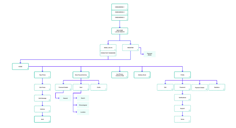
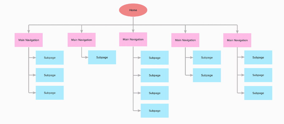
Structure for an online site or a mobile app means an organized hierarchy of pages or features.
Example : Mobile App
Example : Website
Why does good structure matter?
A good app/site structure means an honest user experience.
- When app navigation makes logical sense, people are more easily able to find what they’re trying to seek out .
- They will spend longer on your app.
- They may even recommend it to others.
Search Engine Optimization (SEO)
- Google and other search engines use the structure of your site to figure out what content is significant and what’s less relevant.
Structure Organization
Every website or app that has quite few pages uses some structure for organizing the content. The foremost common structure is to categorize pages into groups and sub groups. The highest result’s the Hierarchy of the content.
The shape of the hierarchy features an enormous impact on the user’s experience
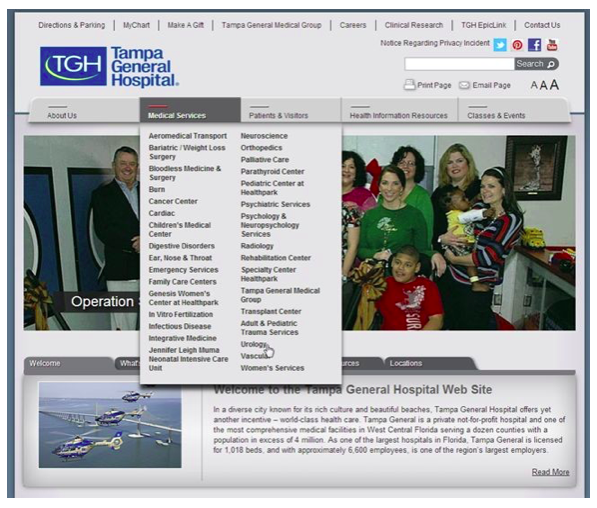
Flat Organizational Structure:
The website shows a long list of more than 30 items under ‘Medical Services’.
Pros
- Very easy to urge.
Cons
- Users are getting overwhelmed by numerous links.
Deep Organizational Structure:
UF Health Website shows the disease-specific information
Home>Patient Care
Pros
- Well Organized Content
Cons
- User possesses to click through numerous levels to urge to specific content
- User become lost, distracted
- User feels he has done enough…!
Flat vs. Deep Structure – Which is best?
While there’s no right answer as it depends on multiple factors:
- Flat hierarchies tend to work well if you’ve distinct, recognizable categories, because people don’t have to click through many levels. When users know what they have , simply get out of the way and permit them to seek out it.
- But, there are exceptions to every rule. In some situations, there are just too many categories to mean all of them at one level, then a Deep hierarchy would be the upper option.
Mobile IA Popular Patterns
Mobile devices have their own set of Information Architecture patterns.
There’s no “correct “way to architect a mobile App or website. Instead, let’s take a look at a variety of the foremost popular patterns.
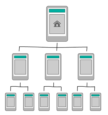
Hierarchy
The hierarchy pattern could also be a typical site structure with an index page and a series of sub pages. If you’re designing a responsive site you will be restricted to this , however introducing additional patterns could allow you to tailor the experience for mobile.
Good for:
Organising complicated structures that require to follow a desktop site’s structure.
Watch for:
Navigation. Multi-faceted navigation structures can present a haul to people using small screens.
Hub & Spoke:
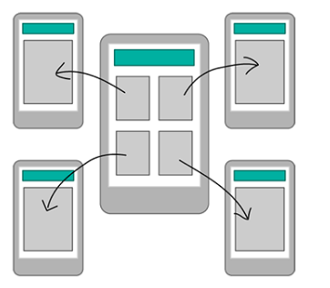
A hub and spoke pattern gives from activities begins from which users tasks are accomplished. This has historically been used on desktop where a workflow is restricted (generally because of technical restrictions sort of a form or purchasing process) however this is often often becoming more prevalent within the mobile landscape because of users being focused on one task, also because the shape factor of the device, making a worldwide navigation harder to use.
Good for:
Multi-functional tools, each with a particular internal navigation and purpose.
Watch for:
Users that want to multitask.
Nested Doll:
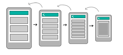
The nested doll pattern leads users during a linear fashion to more detailed content. When users are in difficult conditions this is often a quick and easy method of navigation.
It also gives the user a strong sense of where they’re within the structure of the content because of the perception of moving forward then back.
Good for:
This will even be used as a subsection pattern inside other parent patterns, just like the quality hierarchy pattern or hub and spoke.
Watch for:
Users won’t be able to quickly switch between sections so consider whether this might be suitable, rather than a barrier to exploring content.
Tabbed View:
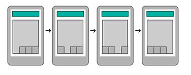
This is a pattern that regular app users are getting to be familiar with . It’s a group of sections tied together by a toolbar menu. This permits the user to quickly scan and understand the whole functionality of the app when it’s first opened.
Good for:
Tools based apps with a similar theme. Multi-tasking.
Watch for:
The pattern is good for very simple content
Bento Box/Dashboard:
The bento box brings more content onto the screen by using components to display the subject of related tools or content.
This pattern is more suited to tablets than mobile because of its complexity. It are often really powerful because it allows the user to understand key information at a glance , but does heavily believe in having a well-designed interface with information presented clearly.
Good for:
Multi-functional tools and content-based tablet apps that have a uniform theme.
Watch for:
The tablet gives you more space to utilise the pattern well, however it becomes especially important to know how an end user will interact with and between each of the content, to make sure that app is simple and efficient.
Filtered View:
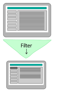
Filtering, also as using faceted search methods, are often a superb way to allow users to explore content in a way that suits them.
Filtering, as well as using faceted search methods, can be an excellent way to allow users to explore content in a way that suits them.
Good for:
Apps or sites with large quantities of content, like articles, images and videos. are often an honest basis for magazine style apps or sites, or as a sub pattern within another navigational pattern.
Watch for:
Mobile. Filters and faceted search are often difficult to display on a smaller screen thanks to their complexity.


